The DOs & DON’Ts of Effective Hotel Websites: Part 2 of 5
A great website can be an extremely powerful digital marketing tool. It can help establish a brand and generate more business – if done correctly.
A website also gives your hotel the opportunity to present its beautiful visual story in a really effective way. It helps travel shoppers get a sense of the services, as well as the atmosphere, your hotel can offer them.
Check out these DOs and DON’Ts of an effective hotel website.

DOs:
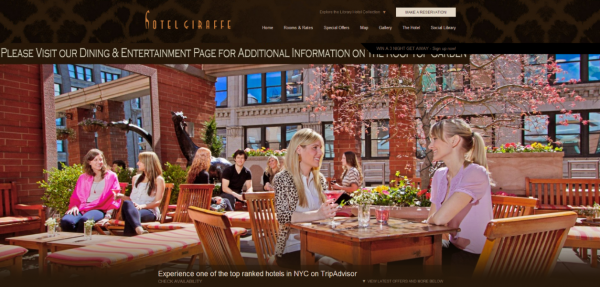
Do have a visually-dominated website. You most likely have many great visuals of your hotel already; therefore, make sure you are showing them off on your property’s website (and if you don’t, here are some ideas to easily find great visuals). With 55% of travelers listing photos as helpful content when looking for trip ideas, it’s very important to have a website that has a visual-first mentality. Check out Hotel Giraffe’s website to get a sense of what a visual-first website looks like.
Do highlight your guest rooms. Images of guest rooms are the most viewed category of image, followed by restaurants, according to an extensive Leonardo study of over 500,000,000 media items, so make sure to feature large visuals of the guest’s home away from home.
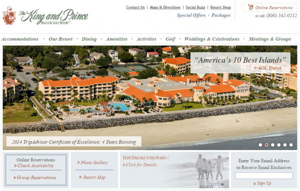
Do showcase your unique features. Having your own property website that showcases your unique features can help travel shoppers understand why they should choose you. Whether you want to highlight an amenity you provide to your guests or your amazing location (and every hotel’s location has a story!), show it off on your hotel’s website through attention-grabbing visuals. The King and Prince Beach & Golf Resort shows off what makes them special with a beautiful, visual rotating banner on the homepage of their website.

Do understand SEO. You want consumers to be able to find your carefully created stories quickly and easily, which makes search engine optimization (SEO) an important part of your hotel website. SEO-enabled photos and videos will ensure that consumers can find you as they search through the pages of choices available to them across travel websites. Ensuring your hotel website is SEO-enabled at the very least, or SEO-optimized, can make it easier for travel shoppers to find you and book directly.
Do be social! Having social media links on your hotel website’s home page is extremely important in your hotel’s overall digital marketing strategy. It helps you connect the pieces of your online hotel story together. It will also help you build a following and increase engagement on your various social media accounts. As a best practice, your social media links should be placed somewhere near the very top of your website homepage – so they can’t be missed! Head on over to the Staybridge Suites London’s website to see a good example of where your social media links should be.
Do get mobile-optimized. Mobile is becoming an immensely important aspect of the travel shopping journey as 71% of travel shoppers will switch between devices at some point in their journey. Since hotels want to have the largest possible reach for online travel shoppers, they have to accommodate those who love to travel across different screens when booking trips.
DON’Ts:
Don’t be text-heavy. Some things on your website should be text, such as address and contact info; however, since 65% of people are visual learners, online travel shoppers will not be satisfied with a website that is text-heavy. In the words of Jay Baer, author of New York Times bestselling book Youtility, “Online business success is largely driven by pictures, not words.” Make sure your hotel has a mix of visuals and text.
Don’t forget about the details. Be sure to include detailed photos of all of your property’s amenities and features. It’s important to be detailed with your hotel’s visuals and photo information, as 92% of travelers are more likely to book with accommodations that post detailed property descriptions and photos.
Don’t have a slow-loading website. You must make sure your website does not take a long time to load. Studies show that travel shoppers will wait no more than three seconds before abandoning a website – now that’s fast! All your website visuals should load quickly and not have any kind of delay – or you may lose the travel shopper forever.
Don’t neglect to include important information. Your website is a place travel shoppers go to learn more about your hotel. Useful information, such as nightly rates or directions, should be easily accessible and found. According to the Millennial Impact, 65% of Millennials claimed that finding missing or unavailable information on a website was their biggest pet peeve. Information that you know is highly important and/or popular with your travel shoppers and guests should always be placed somewhere on the first page of your website.
Don’t forget to include special offers. Special offers are significant to travel shoppers, as Skift reports that 44% of global travelers consider them important to booking. Special offers can also entice travel shoppers to book directly on your hotel website. Be sure to clearly feature them on your home page as well as designating a tab on your website featuring your hotel’s specials.
Don’t forget to organize your media. It’s definitely paramount to understand the value of arranging your media content into a well-designed media gallery with easy-to-navigate tabs. Travel shoppers admire media galleries that enable them to efficiently explore every aspect of a hotel’s property, so that they can discover what they are looking for.
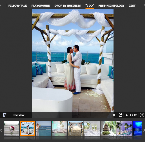
Don’t ignore targeting. Your website can’t be everything to every travel shopper. On the other hand, your hotel definitely has a few target demographics that you can curtail your content to. Whether your hotel specializes in hosting business conferences or even weddings, you can easily adjust your website’s content to appeal to the many target demographic groups that your hotel attracts. Your hotel’s website can easily target different demographics by using media tabs for your specialities. The San Juan Water & Beach Club Hotel is a great example as they utilize their media tabs to curtail their content to multiple demographics – from the leisure traveler to the bride-to-be.

Don’t make it difficult to book. Many hotel websites seem to forget to include a CTA (call-to-action) on every page of their site. Provide a clear path to booking a room on every single page of your website. Pairing a “Book Now” button with a special offer can also help to turn ”website lookers” into ”website bookers.”
Want to learn more about how you can improve the quality of your website? Read our eBook, The Anatomy of a Visual-First Website Experience – Best Practices For Hotel Marketers
This blog post is the second in a series of five blog posts about creating an effective web marketing strategy to reach and engage travel shoppers online with a successful hotel website. Check out Part 3: How to Turn Good Visuals into Great Stories.
